Best Color Palette Generators for Web Designers
Color is one of the most powerful tools in a designer arsenal. The right color palette evokes emotion, establishes brand identity, guides user attention, and creates visual harmony across an entire interface. Yet choosing colors that work well together is notoriously difficult — there are over 16 million possible hex colors, and only a tiny fraction of combinations produce pleasing results. Color palette generators solve this problem by applying color theory principles to generate harmonious schemes automatically, giving you a professional starting point that you can refine to match your vision.
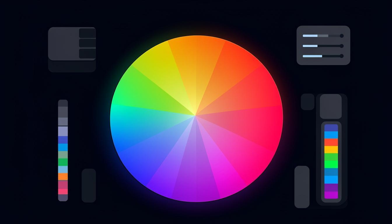
Color Theory Basics
Understanding basic color theory helps you use palette generators more effectively. The color wheel organizes colors by their relationships, and classic harmony types define how colors relate to each other. Complementary colors sit opposite on the wheel and create high contrast. Analogous colors sit adjacent and create smooth, cohesive schemes. Triadic colors form an equilateral triangle for balanced vibrancy. Split-complementary offers contrast with less tension than direct complementary. Tetradic (or double-complementary) uses four colors for rich, complex palettes. Each harmony type creates a different mood and works better for different applications.
Palette generators use these relationships programmatically. You select a base color and a harmony type, and the tool calculates the corresponding colors mathematically. This guarantees color relationships that are theoretically harmonious, though you still need to evaluate the results in context — theoretical harmony does not always translate to visual appeal in a specific design.
Top Color Palette Generators
Toolmetry Color Tools
Toolmetry provides a suite of color tools including a palette generator, color picker, contrast checker, and gradient builder. The palette generator supports all major harmony types and allows fine-tuning of each generated color. The built-in contrast checker ensures your palette meets WCAG accessibility standards, showing which color combinations pass AA and AAA requirements. This integration of generation and accessibility checking in one tool streamlines the design process significantly.
Community-Driven Palette Sites
Platforms like Coolors and ColorHunt feature palettes created and curated by the design community. These are invaluable for inspiration because they represent combinations that real designers have tested in actual projects. You can browse by popularity, color, tag, or theme. The limitation is that community palettes may not meet accessibility standards, so always verify contrast ratios before using them in production designs.
AI-Powered Palette Generators
A newer category of tools uses AI to generate palettes based on text descriptions, images, or mood keywords. Describe the feeling you want — calm and professional, energetic and modern, warm and inviting — and the AI produces several palette options. These tools are particularly useful when you have a conceptual direction but no specific starting color. They can also extract palettes from uploaded images, which is helpful for matching a brand existing visual identity.
Building a Complete Design Color System
A production color system needs more than five harmonious colors. You need primary and secondary brand colors, semantic colors (success, warning, error, info), neutral tones for text and backgrounds, and variants of each color for different states (hover, active, disabled). Start with your base palette from a generator, then create variants by adjusting lightness and saturation while maintaining the same hue. This systematic approach ensures consistency and makes your design tokens reusable across components.
| Color Role | Purpose | Example |
|---|---|---|
| Primary | Brand identity, CTAs | #0066FF |
| Secondary | Supporting elements | #6C63FF |
| Success | Positive actions | #00C853 |
| Warning | Caution states | #FFB300 |
| Error | Problem states | #FF3D00 |
| Info | Informational | #00B8D4 |
| Background | Page backgrounds | #FFFFFF |
| Surface | Cards, modals | #F5F5F5 |
| Text Primary | Main content | #212121 |
| Text Secondary | Supporting text | #757575 |
Accessibility and Color
Approximately 8% of men and 0.5% of women have some form of color vision deficiency. Designing for accessibility means ensuring your color palette works for these users. The WCAG guidelines require a minimum contrast ratio of 4.5:1 for normal text and 3:1 for large text (AA level). AAA level requires 7:1 and 4.5:1 respectively. Never rely on color alone to convey information — always provide a secondary indicator like an icon, pattern, or text label. Test your palette with color blindness simulators to ensure all users can distinguish the visual elements in your design.
Color Psychology in Web Design
Color psychology plays a significant role in how users perceive and interact with websites. Blue conveys trust and professionalism, making it popular for financial and technology companies. Green suggests growth and health, common in environmental and wellness brands. Red creates urgency and excitement, effective for clearance sales and food brands. Purple implies luxury and creativity, used by premium and artistic brands. Orange is energetic and friendly, popular with retail and food delivery services. While cultural associations vary, these general patterns provide a useful starting point for choosing colors that align with your brand message. Test color choices with your specific audience, as individual preferences and cultural contexts can override general psychological associations.
Color in Dark Mode Design
Dark mode has become a standard feature that users expect. Designing color palettes that work in both light and dark modes requires careful planning. Start with the same hue family but adjust lightness and saturation for each mode. Dark backgrounds absorb color intensity, so accent colors may need higher saturation to maintain visual impact. Avoid pure white text on pure black backgrounds — this extreme contrast causes eye strain. Instead, use off-white text on dark gray backgrounds. Test all color combinations in both modes, checking contrast ratios for each. Many palette generators now include dark mode previews, making it easier to evaluate how your colors look in both contexts before committing.
Creating Design System Color Tokens
For scalable design systems, color tokens provide a consistent naming convention and abstraction layer. Define semantic tokens like color-action-primary, color-surface-background, and color-content-text rather than using hex values directly. This allows you to change the underlying color in one place and propagate it throughout the entire design system. Organize tokens in three tiers: global (raw color values), alias (semantic purpose), and component (specific use). This three-tier system provides maximum flexibility while maintaining consistency across your entire application. Token-based color systems also make theme switching straightforward — simply map the semantic tokens to different global values for each theme.
Color Accessibility Testing Tools
After creating your color palette, thorough accessibility testing ensures all users can perceive your content. Contrast checkers compare foreground and background colors against WCAG standards, reporting pass or fail for AA and AAA levels. Color blindness simulators show how your palette appears to people with different types of color vision deficiency — protanopia (red-blind), deuteranopia (green-blind), and tritanopia (blue-blind). Some tools also simulate total color blindness (achromatopsia) and cataracts. Run your entire palette through these simulators and adjust any colors that become indistinguishable. Remember that accessibility testing is not just about compliance — it is about ensuring every user has a quality experience with your product. Accessible design often improves the experience for all users, not just those with visual impairments.
Responsive Color Systems
Modern web applications need color systems that work across devices, display technologies, and user preferences. OLED screens display deeper blacks and more vivid colors than LCD screens, which can make your palette appear differently than intended. Color calibration varies between devices, so a palette that looks perfect on your calibrated monitor may appear quite different on an average user phone. Design your palette with enough variation that it remains effective even with slight color shifts. Use relative color relationships (which are preserved across displays) rather than relying on specific absolute color values. Test your palette on multiple devices and under different lighting conditions to ensure it works in the real-world conditions your users experience.
Color Tools for Print Design
Designing for print requires different color considerations than screen design. Print uses CMYK color space rather than RGB, and colors that look vibrant on screen may appear dull in print due to the smaller gamut of CMYK printing. Use color tools that include CMYK preview and Pantone matching capabilities when designing for print. Convert your hex or RGB values to CMYK and check for out-of-gamut warnings before sending files to print. Soft proofing tools simulate how colors will appear on different paper types and printing processes. Some palette generators include print-specific modes that restrict colors to the CMYK gamut, ensuring your chosen palette will reproduce accurately in printed materials.
Frequently Asked Questions
How many colors should a web palette have?
A functional web design palette typically includes 5-10 core colors: one or two brand colors, 3-4 neutral shades (white, light gray, dark gray, near-black), and 2-3 semantic colors for status indicators. From these core colors, you generate variants (lighter, darker, more transparent) as needed. Starting with fewer colors and expanding systematically produces more cohesive results than beginning with too many.
What is the 60-30-10 color rule?
The 60-30-10 rule suggests using your dominant color for 60% of the design (typically backgrounds), your secondary color for 30% (sections, cards, navigation), and your accent color for 10% (CTAs, highlights, important elements). This proportion creates visual balance and hierarchy. While not a strict rule, it is a helpful starting point for applying a palette to a layout.
How do I pick a color palette for a dark theme?
For dark themes, invert the value hierarchy: use dark neutrals for backgrounds and lighter shades for text and emphasis. Maintain the same hue relationships as your light theme but adjust the lightness and saturation. Dark backgrounds absorb color intensity, so you may need to increase saturation slightly for accent colors to maintain their visual impact. Always check contrast ratios carefully — dark theme accessibility violations are common when designers prioritize aesthetics over readability.
Can I use multiple color palettes on one website?
Yes, but with caution. Different sections or features can have distinct accent colors while sharing common neutral tones and typography. This creates visual variety while maintaining overall cohesion. The key is ensuring all palettes share at least one or two common elements — typically the background, text colors, and one brand color. Without these shared elements, the site will feel disjointed rather than cohesive.
Try These Tools on Toolmetry
All the tools mentioned in this article — and many more — are available for free on Toolmetry. No signup required.
Explore ToolmetryShahid Reza
Toolmetry Team
Writing about tools, technology, and productivity. Building useful things at Toolmetry.
Free online tools for developers, designers, and professionals. No signup, no limits.
Visit toolmetry.pro