Complete Guide to CSS Gradient Generators
CSS gradients are among the most versatile and visually impactful tools available to web designers. From subtle background transitions to bold hero sections, gradients add depth, visual interest, and a modern aesthetic to any interface. However, hand-coding gradient CSS can be tedious and error-prone, especially when dealing with multiple color stops, complex angles, and radial positioning. CSS gradient generators eliminate this friction by providing visual, interactive interfaces that output production-ready CSS code.
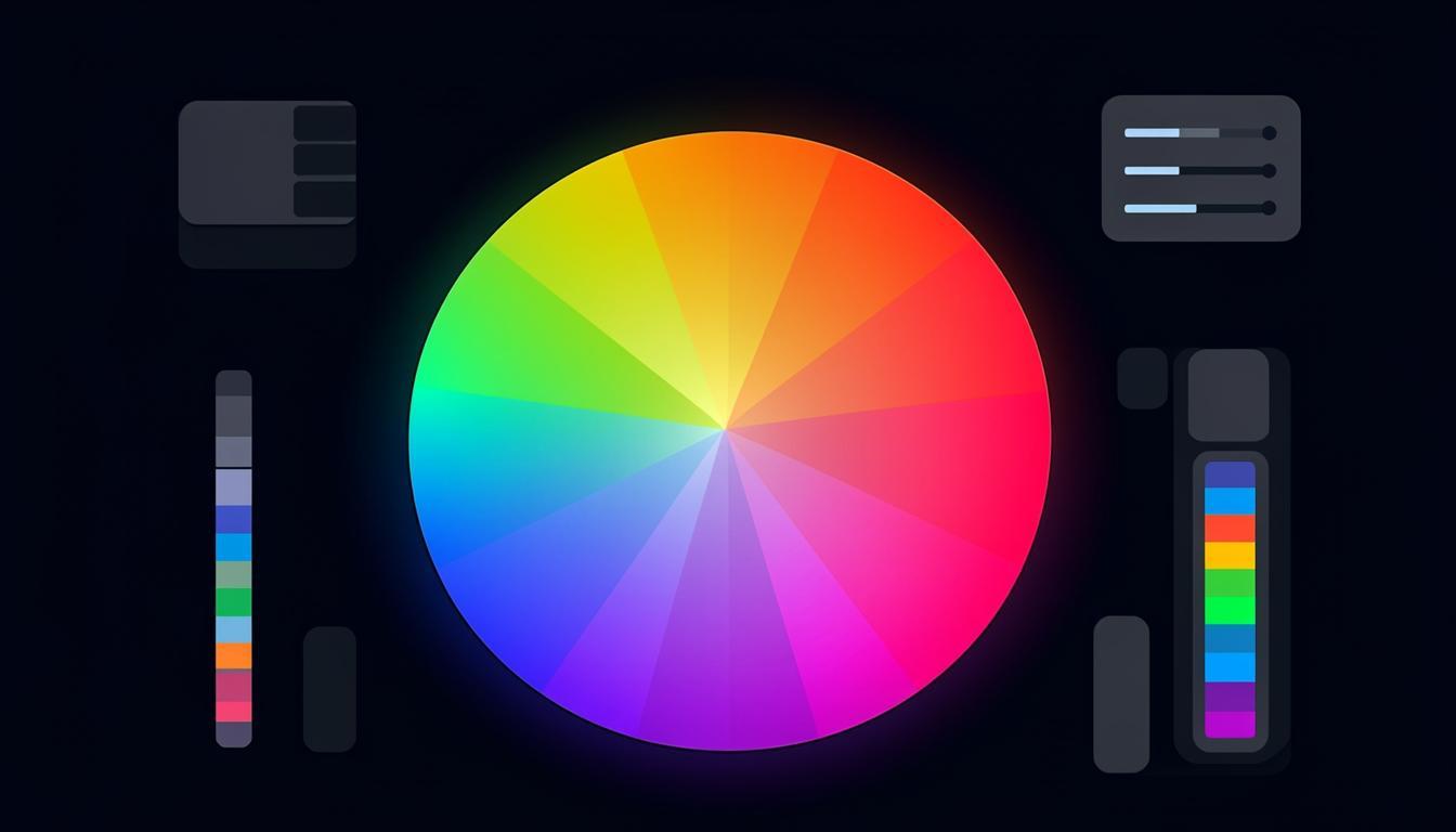
Types of CSS Gradients
Linear Gradients
Linear gradients transition colors along a straight line defined by an angle or direction. They are the most commonly used gradient type and work well for backgrounds, buttons, and overlays. A linear gradient can have as few as two colors or as many as you need. The key parameters are the direction (angle in degrees or keywords like to bottom right) and the color stops (which define the colors and their positions along the gradient line).
Modern CSS also supports repeating linear gradients, which create patterns by repeating the gradient cycle. This is useful for creating striped backgrounds, barber-pole effects, and other repeating patterns without using image files.
Radial Gradients
Radial gradients emanate from a central point outward in a circular or elliptical shape. They are perfect for creating spotlight effects, vignettes, and organic-looking backgrounds. The shape can be circular (equal radius in all directions) or elliptical (different horizontal and vertical radii). You can position the center point anywhere within the element and control the size with keywords like closest-side, farthest-corner, or explicit pixel/percentage values.
Conic Gradients
Conic gradients transition colors around a center point in a circular sweep, like a color wheel. They are relatively newer but have excellent browser support in 2025. Conic gradients are ideal for pie charts, color wheels, and unique decorative effects. When combined with repeating gradients, they can create complex geometric patterns that would be impossible with other gradient types.
Features of Quality Gradient Generators
The best CSS gradient generators share several key features: real-time preview that updates as you adjust parameters, the ability to add and remove color stops by clicking on the gradient bar, angle and position controls with both visual and numerical input, preset palettes for quick inspiration, and clean CSS output that you can copy directly into your stylesheets. Advanced generators also support multiple gradient layers, which allow you to combine different gradient types for complex effects.
You can explore gradient tools and many more design utilities on Toolmetry, where all tools are free to use without signup.
Advanced Gradient Techniques
Multiple Background Layers
CSS allows multiple backgrounds on a single element, and you can stack multiple gradients to create rich, layered effects. For example, combining a radial gradient spotlight with a linear gradient background creates a focal point effect that draws the eye to specific content. The key is to use semi-transparent color stops so underlying gradients show through.
Gradient Text
Applying gradients to text is a popular design trend. The technique uses background-clip: text and -webkit-text-fill-color: transparent to make the gradient visible through the text characters. This works best with bold, large text where the gradient is clearly visible. Use high-contrast color combinations for maximum impact on dark backgrounds.
Animated Gradients
Animating gradients creates eye-catching effects for hero sections and CTAs. By using a large background-size and animating the background-position, you can create a smooth, continuously moving gradient. CSS animations perform well because they can be hardware-accelerated. Use subtle color shifts for a professional look or bold, contrasting colors for attention-grabbing effects.
Mesh Gradients
While not natively supported in CSS yet, mesh gradients (multi-point gradients like those in Figma or Apple design) can be approximated using multiple overlapping radial gradients with blur. This technique creates organic, flowing color transitions that mimic the look of mesh gradients. Several online generators can create the CSS code for these complex effects automatically.
Best Practices for Using Gradients
Keep accessibility in mind when using gradients. Ensure sufficient contrast between text and gradient backgrounds, especially at the lightest or darkest points of the gradient. Test with contrast checking tools at multiple positions across the gradient. Avoid using too many colors in a single gradient — three to four stops is usually sufficient for a clean, professional look. Always provide fallback background colors for browsers that may not support certain gradient features, and use the prefers-reduced-motion media query to disable animated gradients for users who prefer reduced motion.
Creating Accessible Gradients
Accessibility should be a primary consideration when designing with gradients. The most common accessibility issue is insufficient contrast between text and gradient backgrounds. Because gradients transition between colors, contrast varies across the element. Test contrast at multiple points, particularly at the lightest and darkest areas of the gradient. Use tools that check contrast against specific color values to ensure text remains readable everywhere. For dark backgrounds with light gradients, ensure text contrast remains above the 4.5:1 WCAG AA minimum. For light backgrounds, dark text must meet the same threshold. Consider using semi-transparent overlays on top of gradients to create a more consistent text background while still showing the gradient effect.
Gradient Design Trends for 2025
Current gradient trends favor subtle, organic color transitions over the bold, high-contrast gradients of previous years. Grainy gradients — which add noise texture to smooth color transitions — create a sophisticated, tactile feel that works well for premium brands. Mesh gradients, with their multi-point color blending, appear in everything from app interfaces to marketing websites. Glassmorphism, which combines gradient backgrounds with frosted-glass overlays, continues to be popular for UI design. Another emerging trend is dynamic gradients that respond to user interaction, changing colors or direction based on mouse position, scroll depth, or time of day. These interactive gradients create engaging experiences that encourage users to explore and interact with the interface.
Exporting and Implementing Gradients
When using gradient generators, the output is CSS code that you can copy directly into your stylesheets. Most generators output standard CSS syntax, but verify compatibility with your target browsers if you are using newer features like conic gradients or hue interpolation. For complex multi-stop gradients, consider using CSS custom properties to define your color stops, making it easy to update colors consistently across your entire application. Some generators also provide Tailwind CSS utility classes, which is useful if you are using the Tailwind framework. Remember that gradients can be combined with other CSS properties like background-size, background-position, and mix-blend-mode for even more creative effects.
Gradient Performance Optimization
While CSS gradients are generally performant, complex gradients can impact rendering speed, particularly on mobile devices. Gradients with many color stops require more GPU processing than simple two-stop gradients. Large background-size values for animated gradients consume significant memory. Radial gradients are typically more expensive to render than linear ones. To optimize gradient performance, minimize the number of color stops, use hardware-accelerated properties (transform and opacity) for animations, avoid animating background-size directly (animate background-position instead), and test performance on low-end mobile devices. For very complex gradient effects, consider using a pre-rendered image instead of a live CSS gradient, especially for above-the-fold content where rendering speed is critical.
Gradient Libraries and Resources
When you need gradient inspiration, several curated libraries provide professionally designed palettes. These resources offer pre-built gradients with CSS code ready to copy and paste. Many include categories like warm, cool, pastel, vibrant, and dark, making it easy to find gradients that match your project mood. Some libraries also provide Tailwind CSS classes and CSS custom property definitions for seamless integration with modern frameworks. Save your favorite gradients in a personal collection so you can maintain visual consistency across projects. Many designers create a gradient library as part of their design system, ensuring all team members use consistent color transitions across the product.
Gradient Generators for Brand Identity
When creating gradients for brand identity, consistency across all touchpoints is essential. Document your gradient specifications in your brand guidelines, including the exact color values, direction, and any special effects. Provide gradient assets in multiple formats: CSS code for web, SVG for digital graphics, and print-ready specifications for physical materials. Some gradient generators can export these specifications in all formats simultaneously, ensuring perfect consistency across media. If your brand uses multiple gradients, establish rules for when each gradient is used — for example, a specific gradient for hero sections, another for CTAs, and a third for decorative accents. This systematic approach maintains visual coherence as your brand scales across products and platforms.
Frequently Asked Questions
Can I use CSS gradients in all browsers?
Yes, CSS gradients have excellent browser support in 2025. Linear, radial, and conic gradients are supported by all modern browsers including Chrome, Firefox, Safari, and Edge. For older browsers, always provide a solid background-color fallback before the gradient declaration so content remains readable.
How many color stops can a CSS gradient have?
There is no hard limit on the number of color stops in a CSS gradient. However, for performance and visual clarity, three to five color stops are typically sufficient. More stops can create smoother transitions but increase CSS file size and rendering complexity. Use the minimum number of stops that achieves your desired visual effect.
Are animated gradients bad for performance?
Animated gradients using background-position animation are generally performant because they can be GPU-accelerated. However, animating the gradient itself (changing colors or stops) is more expensive. For best performance, use a large background-size and animate only the background-position. Always test on mobile devices where GPU resources are more limited.
How do I create a transparent gradient overlay?
Use rgba or hsla color values with alpha transparency in your gradient stops. For example, linear-gradient(to bottom, rgba(0,0,0,0.7), transparent) creates a fade-from-black overlay. This technique is commonly used over background images to ensure text readability while still showing the image underneath.
Try These Tools on Toolmetry
All the tools mentioned in this article — and many more — are available for free on Toolmetry. No signup required.
Explore ToolmetryShahid Reza
Toolmetry Team
Writing about tools, technology, and productivity. Building useful things at Toolmetry.
Free online tools for developers, designers, and professionals. No signup, no limits.
Visit toolmetry.pro