Color Picker Tools: A Designer's Guide to Finding the Perfect Palette
Color is one of the most subjective aspects of design, yet it is also one of the most technically constrained. A color that looks perfect on your calibrated monitor might appear completely different on a mobile screen, fail accessibility requirements, or not translate correctly between design and development handoffs. Color picker tools bridge the gap between aesthetic intuition and technical precision, and understanding how to use them effectively is a core skill for every designer.
Understanding Color Models and Formats
Digital color is represented in several formats, each with distinct advantages. HEX codes are compact and universally supported in CSS, making them the most common format in web development. RGB values map directly to screen hardware and are intuitive for understanding how colors mix additively. HSL (Hue, Saturation, Lightness) is the most designer-friendly model because adjusting individual parameters produces predictable visual changes — increase saturation to make a color more vivid, decrease lightness to make it darker, and rotate hue to shift along the color wheel without altering intensity or brightness.
Professional color picker tools display all formats simultaneously and update them in real time as you adjust any parameter. This cross-format visibility is essential because design tools, development frameworks, and marketing platforms often require different input formats. Being able to copy the exact format you need without manual conversion eliminates a common source of color mismatches between design and implementation.
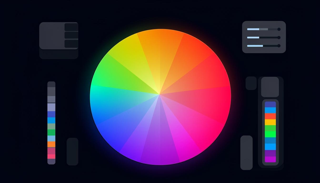
Palette Generation Strategies
Creating a cohesive color palette from scratch is challenging. Color picker tools with palette generation features apply established color theory to produce harmonious combinations automatically. Common generation methods include complementary (opposite colors on the wheel), analogous (adjacent colors), triadic (three equidistant colors), and split-complementary (a base color plus two colors adjacent to its complement). Each method produces a different visual character, and the best tools let you switch between methods while preserving your base color.
Beyond algorithmic generation, the most useful palette tools also consider practical application. They generate tints (lighter versions) and shades (darker versions) of each color, creating the full range of values needed for backgrounds, borders, hover states, and text. A palette with five carefully chosen colors plus their tints and shades provides everything a design system needs. You can explore these generation methods using the color tools on Toolmetry, which offer real-time preview of how palettes look in actual UI contexts.
Accessibility and Contrast Checking
Visual appeal means nothing if your design is not accessible. WCAG guidelines require specific contrast ratios between text and background colors: at least 4.5:1 for normal text and 3:1 for large text at Level AA, with stricter requirements at Level AAA. Contrast checking should be integrated into your color selection workflow, not treated as a separate validation step. The best color picker tools display contrast ratios in real time as you adjust colors, so you never create an inaccessible combination in the first place.
Accessibility considerations extend beyond contrast. Approximately 8% of men and 0.5% of women have some form of color vision deficiency. Tools that simulate different types of color blindness (protanopia, deuteranopia, tritanopia) help you verify that your color choices convey information without relying solely on hue differences. This is particularly important for data visualizations, status indicators, and error states where color carries meaning.
Gradient Tools
Gradients have made a strong comeback in modern design, but creating smooth, visually pleasing gradients requires more than picking two colors. The transition curve, number of stops, and angle all affect the result. Dedicated gradient tools let you add and position multiple color stops, adjust the easing curve between stops, and preview the gradient at different sizes. CSS gradient code is generated automatically, ready to paste into your stylesheet.
Building a Color Workflow
Start with palette generation to establish your core colors, then use tint and shade tools to create the full range of values your design system needs. Check contrast ratios for every text-background combination. Simulate color blindness to ensure information is never conveyed through color alone. Finally, export your palette in all the formats your team needs — HEX for developers, HSL for design tokens, and named values for your component library. This systematic approach ensures that your color choices are beautiful, accessible, and consistently implemented.
Try These Tools on Toolmetry
All the tools mentioned in this article — and many more — are available for free on Toolmetry. No signup required.
Explore ToolmetryShahid Reza
Toolmetry Team
Writing about tools, technology, and productivity. Building useful things at Toolmetry.
Free online tools for developers, designers, and professionals. No signup, no limits.
Visit toolmetry.pro